
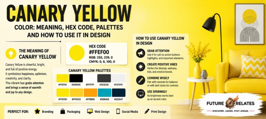

The Canary yellow color is one of those shades that instantly grabs your eye. It’s bright, sunny, and full of energy, named after the cheerful little canary bird. Designers love it, marketers use it, and interior fans keep coming back to it. Let’s walk through everything you need to know about this joyful shade. For more design and color-related insights, explore FutureRelates.
- What Is Canary Yellow Color?
- Canary Yellow Color Codes
- Canary Yellow Color Meaning and Symbolism
- Canary Yellow Color Psychology
- Is Canary Yellow Warm or Cool?
- Canary Yellow vs Lemon Yellow vs Butter Yellow
- Best Colors That Go With Canary Yellow
- Canary Yellow Color Palettes and Harmonies
- How to Use Canary Yellow in Branding
- How to Use Canary Yellow in UI and UX Design
- Canary Yellow in Interior Design and Paint
- Canary Yellow in Fashion, Packaging and Social Media
- Shades, Tints and Variations of Canary Yellow
- Accessibility: Is Canary Yellow Good for Text and Backgrounds?
- FAQs About Canary Yellow Color
- Final Thoughts: When to Use Canary Yellow Color
What Is Canary Yellow Color?
Canary yellow is a bright, vivid, high-saturation yellow. Think of pure sunshine or fresh lemon peel, and you’re pretty close.
Why this shade stands out in the yellow family
What stands out is how punchy it feels. Compared to soft pastels or muddy mustards, canary yellow reads as clean, warm, and high-impact. It’s the kind of yellow that pops on a screen and lights up a wall.
| Format | Common Variant | Notes |
|---|---|---|
| Hex | #FFEF00 | Most widely cited version in design tools |
| Hex | #FFFF8F | Softer, paler editorial version |
| Hex | #FFDF01 | Slightly golden palette version |
| RGB | 255, 239, 0 | Matches #FFEF00 |
| RGB | 255, 255, 143 | Matches #FFFF8F |
| CMYK | 0, 6, 100, 0 | Print-ready bright yellow |
| CMYK | 0, 13, 100, 0 | Golden-leaning variant |
Canary Yellow Color Codes
Canary yellow hex code and why it varies online
Here’s the thing: there isn’t one single “official” canary yellow. The most common hex code you’ll see is #FFEF00, but you’ll also spot #FFFF8F and #FFDF01 floating around.
Why the difference? Editorial palettes, paint systems, and digital color libraries each define the shade a little differently. One site leans golden, another leans pale. All of them are still “canary yellow” in spirit.
RGB, CMYK and HSL values for canary yellow
For the classic version, RGB sits at 255, 239, 0 and CMYK at 0, 6, 100, 0. On the HSL and HSV scale, canary yellow lands around 52 to 56.2 degrees of hue with full saturation. That high saturation is exactly why it feels so alive.
Canary Yellow Color Meaning and Symbolism
Canary yellow carries a warm, happy message. It’s tied to sunshine, joy, optimism, and pure positivity.
The bird-inspired origin of canary yellow
The name comes straight from the yellow canary, a small songbird with sunny plumage. That natural link gives the color a cheerful, lively personality. It also signals visibility, which is why you often see it on warning signs and high-alert graphics. You can also learn more about the broader history, properties, and symbolism of yellow on Wikipedia’s Yellow page.
Canary Yellow Color Psychology
On the positive side, canary yellow sparks happiness, creativity, and energy. It feels friendly and uplifting, like a sunny morning.
But too much of a good thing can backfire. Big blocks of it may cause overstimulation or even a touch of anxiety. It also reads as caution. To be honest, that’s why it works best in doses rather than as a full-room takeover.
Is Canary Yellow Warm or Cool?
Canary yellow is a warm color through and through. Its undertones lean sunny and golden rather than cool or green.
Next to lemon yellow, it feels a bit fuller and less tart. Next to golden yellow, it looks brighter and less deep. That middle-ground warmth is part of its charm.
Canary Yellow vs Lemon Yellow vs Butter Yellow
These three get mixed up all the time, so let’s clear it up:
- Lemon yellow is sharper and slightly cooler, with a zesty edge.
- Butter yellow is soft, pale, and creamy, great for calm interiors.
- Canary yellow sits in between, bright and bold but still sunny.
For loud branding and high-visibility campaigns, canary yellow wins. For gentle rooms and soft fashion, butter yellow often fits better.
Best Colors That Go With Canary Yellow
Best complementary colors for canary yellow
This shade plays well with plenty of partners:
- Blue and royal blue create a bold, balanced contrast.
- Black adds punch and makes canary yellow scream for attention.
- Gray and charcoal cool things down for a modern look.
- Brown and chocolate bring a cozy, earthy feel.
- Lavender or pink soften it into something playful and fresh.
- Green and olive echo its natural, outdoorsy roots.
Canary Yellow Color Palettes and Harmonies
Want ready-made combos? Try these:
- Complementary: canary yellow with deep blue or violet.
- Analogous: yellow blending into orange and lime green.
- Triadic: yellow, blue, and red-pink for high energy.
- Monochromatic: tints and shades of yellow for a soft blend.
- Split-complementary: yellow with two blues for balance.
How to Use Canary Yellow in Branding
Why canary yellow works so well in modern branding
Canary yellow is a magnet for attention. It works beautifully in logos, packaging, and identity systems that want to feel upbeat and confident.
My tip? Use it as an accent, not the whole show. A splash on a button, badge, or headline goes a long way. Overuse it and the energy tips into overwhelming.
How to Use Canary Yellow in UI and UX Design
Accessibility tips for using canary yellow in UI
In digital design, canary yellow shines as an accent color. It’s fantastic for CTAs, highlights, and navigation cues that need to stand out.
One key rule: always use dark text over canary yellow, never white. Dark text on this bright base is far more readable and keeps your interface accessible.
Canary Yellow in Interior Design and Paint
How to balance canary yellow with neutrals
This shade brings instant warmth to kitchens, dining rooms, laundry rooms, and powder rooms. A canary yellow wall can make a small space feel sunny and alive.
Because it reflects a lot of light, pair it with white, gray, or wood tones to keep the mood cheerful without going overboard.
Canary Yellow in Fashion, Packaging and Social Media
Canary yellow as a summer 2026 design trend
Canary yellow has strong seasonal appeal, especially for summer looks and bright campaigns. It grabs eyes on packaging, posters, and social creatives fast.
There’s real interest in cheerful, high-visibility yellows as a design direction heading into 2026, which makes this a smart shade to keep in your creative toolkit.
Shades, Tints and Variations of Canary Yellow
- Light canary yellow: softer and airier, closer to #FFFF8F.
- Dark canary yellow: deeper and more golden.
- Golden canary yellow: richer, with a warm glow.
- Pastel and neon-adjacent versions: dialed down or cranked up for extra effect.
Accessibility: Is Canary Yellow Good for Text and Backgrounds?
Canary yellow works great as a background, but tricky as text. White text on it fails badly for contrast.
For WCAG-friendly results, pair a canary yellow background with black or dark charcoal text. That combo keeps things readable and inclusive.
FAQs About Canary Yellow Color
What is the hex code for canary yellow?
The most common code is #FFEF00, though #FFFF8F and #FFDF01 also appear.
What colors match canary yellow?
Blue, black, gray, brown, green, lavender, and pink all pair nicely.
Is canary yellow good for branding?
Yes! It’s energetic, cheerful, and attention-grabbing, best used as an accent.
Is canary yellow the same as lemon yellow?
Not quite. Lemon yellow is sharper and cooler; canary yellow is warmer and fuller.
Is canary yellow a trend color in 2026?
Bright, cheerful yellows are drawing real design interest heading into 2026.
Final Thoughts: When to Use Canary Yellow Color
The canary yellow color shines brightest when you want energy, warmth, and instant attention. It’s perfect for accents, CTAs, summer campaigns, and sunny room moments.
Use it sparingly for big surfaces and always mind your contrast. Handled with care, this cheerful shade brings a little sunshine to almost any design. For additional guidance on color relationships, contrast, and design palettes, see Adobe’s color theory guide.
For More Information Visit: https://futurerelates.co.uk/